A simple navigation restructure drove engagement KPIs 8% higher than their best ever month.
Digital Catapult had a cluttered, hard-to-navigate website that no longer reflected its brand or strategic goals. We helped them realign their website through targeted, high-impact design changes without touching the core codebase or structure.
Over time, the Digital Catapult (Digicat) website had become disjointed with an internally focused navigation. The lack of clarity and content prioritisation made it hard for users to navigate and interact with its services in a meaningful way.
The challenge set by Digicat’s marketing team was to carry out a quick website refresh to align the website with the company’s strategic mission and brand. This project required a focused and targeted approach.
Redesigning an entire website is a big undertaking that takes many months. In this case, a full rebuild was unnecessary. We made a noticeable impact in just six weeks by identifying key leverage points:
- Navigation
- Homepage
- Page headers
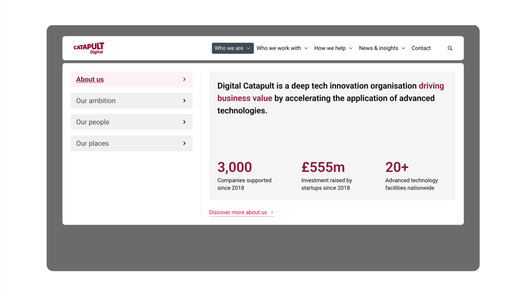
Website navigation rework
We reprioritised the original eight navigational elements into four strategically organised themes, making it easier for users to find and engage with relevant services.
The new mega menu allows users to navigate almost the entire site easily while gaining a better understanding of the organisation’s services.
As users navigate the mega menu, they are drip-fed brand messaging and interesting facts that expand their understanding of the company and its services.
The new mega menu allows users to navigate almost the entire site easily while gaining a better understanding of the organisation’s services.
As users navigate the mega menu, they are drip-fed brand messaging and interesting facts that expand their understanding of the company and its services.
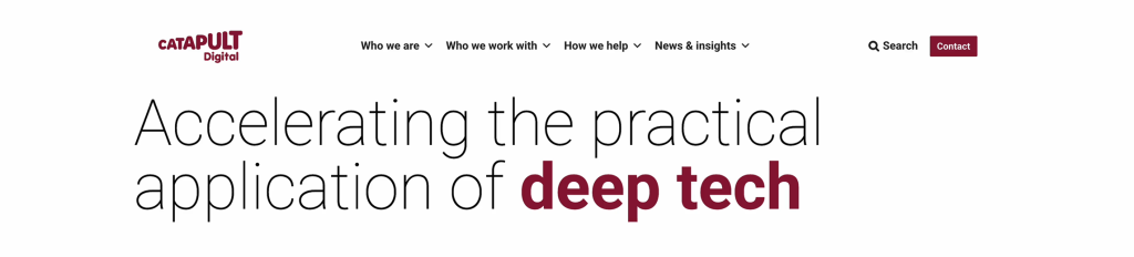
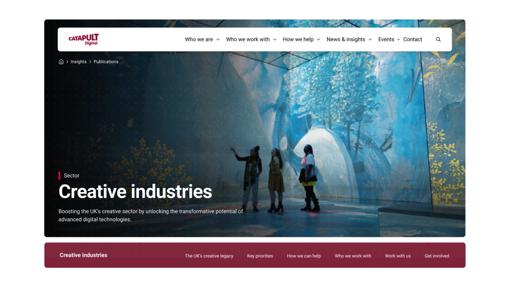
Homepage and headers refresh
Giving a website a new homepage and headers is like having a new haircut; you look and feel different without changing your overall appearance.
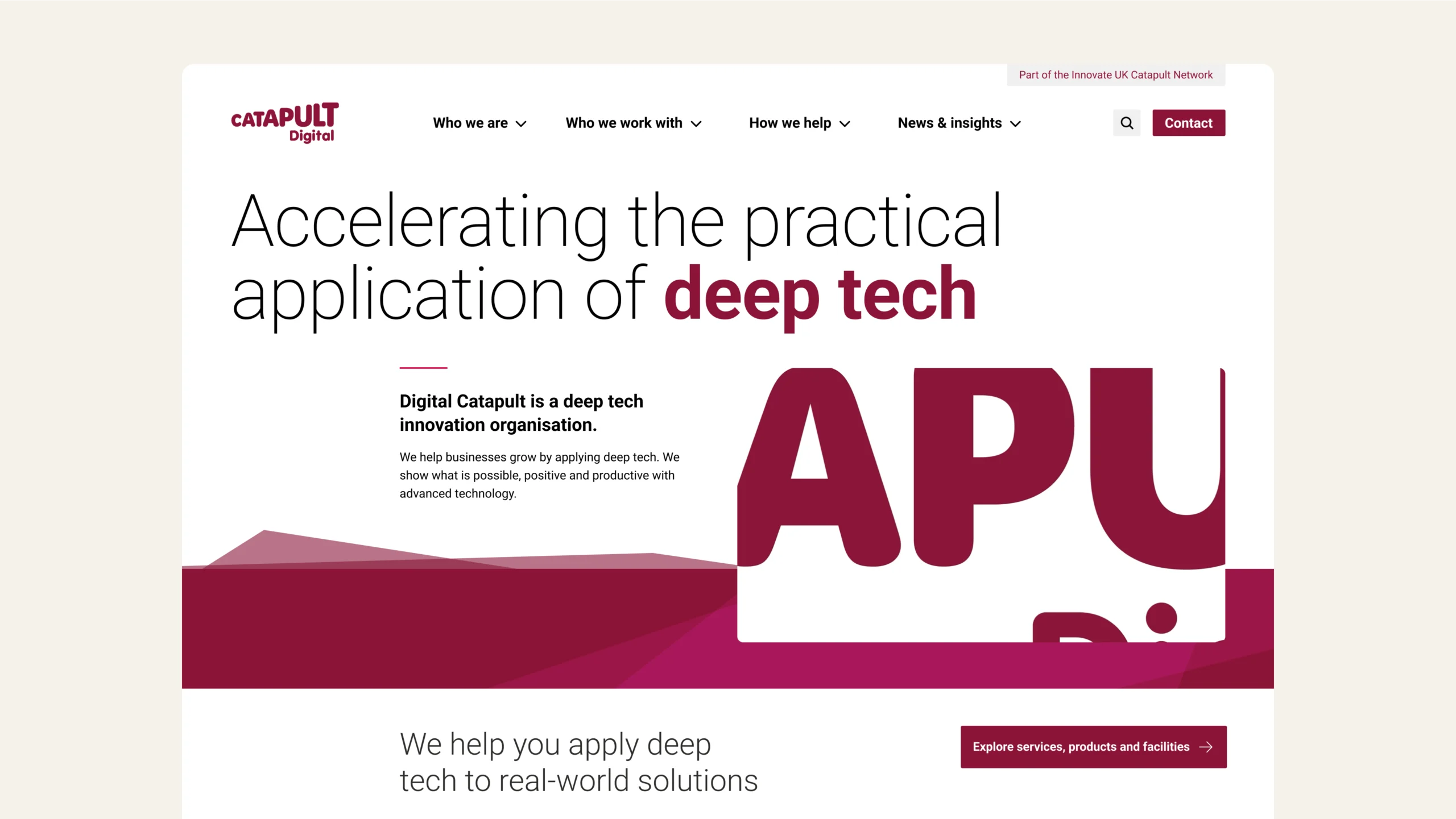
We transformed the homepage into an engaging shop window with clear and aligned brand messaging. Bringing key content above the fold and introducing Digicat through its brand video, we effectively utilised the space to engage visitors and invite further exploration.
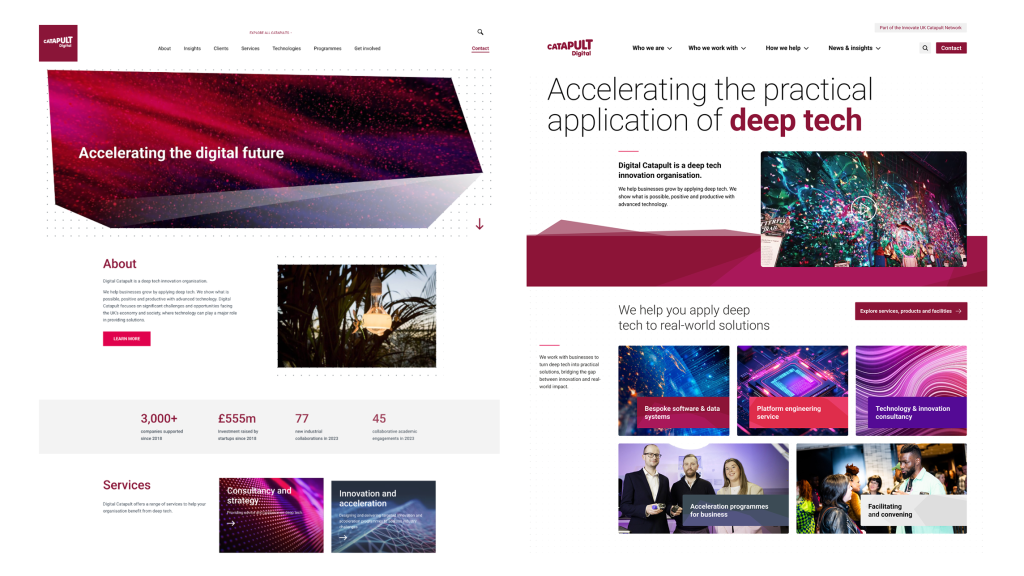
Updating all page headers created a refreshed and cohesive visual design aligned with the Digicat brand guide.
Targeted improvements that drive maximum impact with minimal disruption
This project focused on the elements that would create the highest impact with the least disruption. We delivered the updates without significant changes to the website’s underlying codebase, structure, or content, meaning there was no need for lengthy migration, downtime, or new content.
This project is a reminder that a complete website overhaul isn’t necessarily needed to make a strategic impact. Focused design decisions can drive outsized results when founded on a clear understanding of purpose and audience.
Get in touch if you’d like to see how targeted improvements can refresh your website, improve navigation, and deliver impact without the time and cost of a full rebuild.