Inconsistent execution of websites & digital platforms is costing you customers.
Your innovation programmes and facilities are world-class. Does your customer experience reflect this, or is it quietly undermining the work you do?
Innovation is relentless, challenging, and requires a mindset that is comfortable working at a fast pace while not having all the answers and working within defined funding cycles.
When your digital portfolio is developed at pace to match these funding cycles, fragmentation is almost inevitable. Each new cycle brings new programmes, new platforms, new micro sites, each solving the immediate problem for the team that needed it, each one built quickly and independently of everything that came before.
This is understandable, even necessary, but over time it leaves a tangled web of disjointed digital products and an inconsistent customer experience that ultimately costs customers and revenue somewhere down the line.
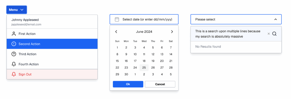
And while most of the world is obsessing over AI, many of the innovation organisations we see still have three different types of form on their website and several ways to display funding opportunities.
The ambition is world-class. The experience of navigating it often isn’t, and the problem only compounds as organisations grow.
“88% of online consumers are less likely to return to a website after a bad experience” — linearity.io
Our clients typically operate a corporate website, programme platforms, application journeys, event micro sites, community spaces & partner tools.
Often each has a different log-in screen (that requires a different password), different navigation, different calls to action. This lack of consistency is your enemy.
When we force a user to learn several different ways to find funding opportunities, we aren’t being ‘innovative’, we’re just increasing their cognitive load until they eventually just close the tab and look somewhere else.
The solution is a design system. The question is when should I start one? The answer is right away.
But first, what exactly is a design system?
From a design perspective, it is a library of pre-built, pre-coded components: the buttons, cards, form fields and navigation patterns that make up every page and application you build. Each component is designed once, tested for accessibility and made available to anyone who needs to build something new, whether that is a landing page, a programme application or an event microsite.
Beyond individual components, a design system also contains patterns: more complex workflows that combine multiple components across multiple steps. A funding application journey, for example, or a community onboarding flow. These are not built from scratch each time. They are assembled from parts that already work.
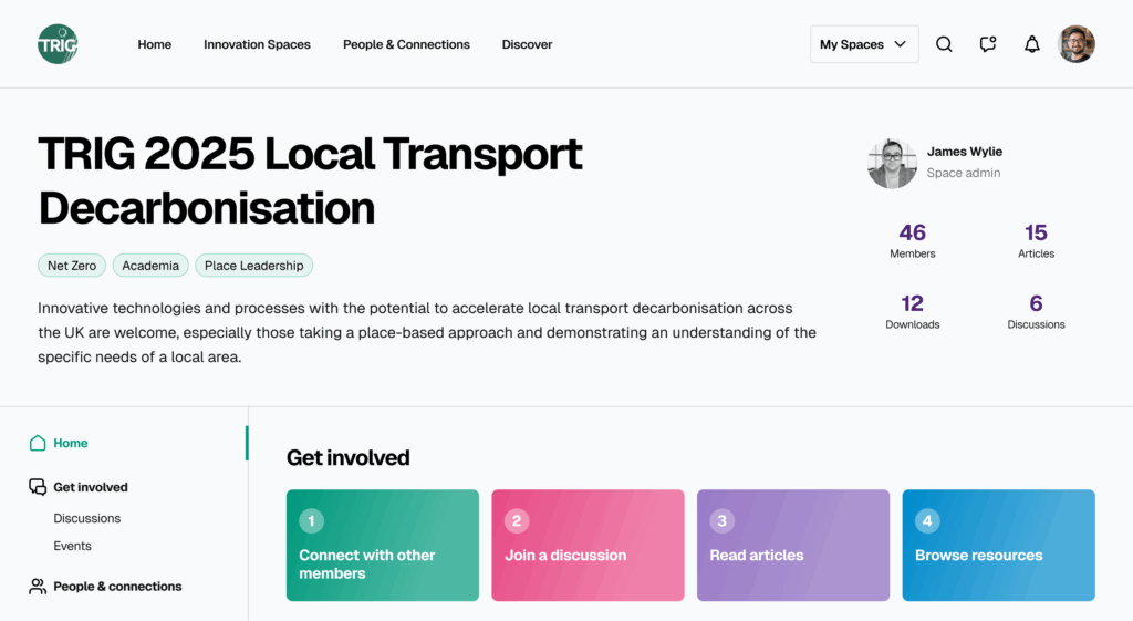
From an organisational perspective, a design system gives you a framework to govern how your digital platforms work, delivering a consistent experience every time, across every touchpoint.
Think of it as a living brand guide, one that covers not just how things look but how they work. It gives new agencies and partners a clear brief to build from. It gives internal teams a toolkit for creating new pages without going back to square one. It gives your development team a code library that means new features get built faster, more consistently and with less budget wasted on reinvention.
Unlike a static set of brand guidelines, a design system evolves. As new components and patterns are created, they are added to the library and made available to everyone. The system gets more useful the more it is used.
The tools we use are:
Figma is where the design system lives visually. It is a design tool, but with a design system embedded into it, it becomes something more accessible than that. Non-designers can open Figma, pick from an existing set of approved components and lay out a new page or campaign without needing to brief a designer or wait for a developer. It puts the power to create on-brand, consistent work into the hands of the people who need it most.
Storybook is where the design system lives in code. It acts as a living catalogue of every component your development team has built, showing exactly how each one looks and behaves in the real production environment, not a mockup. Different states, different sizes, different configurations, all documented and accurate. Because Storybook is built from your actual codebase, there is no gap between what is documented and what gets shipped. When a component is updated, the catalogue updates with it.
Together, Figma and Storybook give you a complete picture of your design system: what exists, what it looks like and how to build with it. One for design, one for code, both pointing at the same source of truth.
How to get started
The good news is that you do not need a big launch, a new hire or a six-month project to begin. You just need a starting point and a small amount of discipline about what happens next.
My recommendations are:
Pick your next digital project and use it as the opportunity to start. Work with your agency or design team to identify the core components that are being built: buttons, forms, navigation, cards. Document them as you go rather than retrospectively. You do not need to capture everything at once. A small, accurate system is a good starting point. You can build the design system over time as you run more projects.
Give it a home. A Figma organisation account for the components, a Storybook instance for the code, and a simple shared document for the governance rules. If you are not ready for all three, start with Figma and the governance documentation. The important thing is that it has a single home that everyone has access to.
Form a working group. Invite your head of product if you have one, someone from marketing or a customer-facing team that uses digital products. The point is not to have people choosing components they like. It is to make sure decisions reflect the needs of the customers and the organisation rather than the preferences of whoever happened to be in the room. Remember the design system’s key focus on how it works not what it looks like.
Designate an owner. One person whose job it is to say “does this match what we already have?” That is the entire governance model to start with.
I have put together a practical guide that walks you through each of these steps in more detail, including how to brief your agency, how to set access rules and how to make sure the system grows rather than stagnates.
Download the full guide here.
You do not have to build it from scratch either. At Temper we have spent four years building an innovation focused design system with components and patterns that are tried and tested across every platform we have delivered.
Get in touch if you would like to discuss using it for your organisation.